Last June while traveling in Amsterdam for the REMATEC show we took a break to to immerse ourselves in some Dutch design. We love Delft pottery and windmills as much as the next guy, but that’s not what we mean– we wanted a window into the contemporary Dutch design world. We started with the Stedlijk Museum for a historical timeline of Dutch modern design, then wound through the Amsterdam canals to the Droog Hotel, a conceptual design hotel with only one room. As we dodged bicycles and crossed picturesque canals, we found ourselves enamored with the Dutch aesthetic.
Strolling down a narrow street of leaning homes with lacquered emerald doors, we stumbled upon a door that was not like the others– it read LETTERPRESS AMSTERDAM in bright red and blue letters. We stopped in our tracks. “Is this open to the public?” I wondered aloud. Jamie, of course, was bold enough to walk right in.
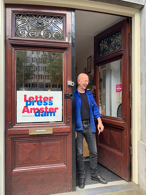
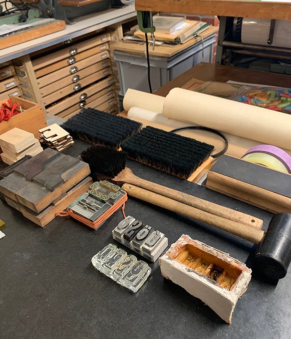
Behind those formidable doors lay something magical. An immaculate letterpress studio with drawers upon drawers of type, multiple machines, and prints of poetry, prose, and posters hanging on the walls. The studio belongs to Thomas Gravemaker, a master printer and typophile who has travelled the world making and teaching the art of letterpress. He quickly welcomed us inside and gave us a full tour, showing us everything from incredibly miniscule 3 point letters to the big, stylized blocks of vintage newspaper headlines.
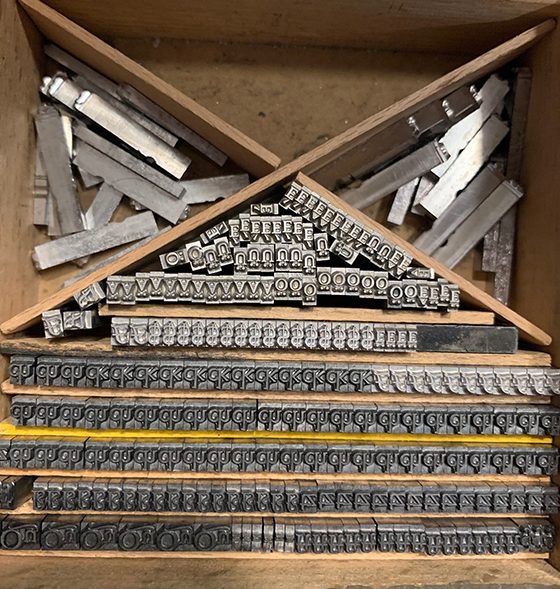
We talked about type in metal and wood, collector’s type and the ones that are the hardest to find. We talked paper and ink, keeping your fingers out of the press, and the mathematical precision of laying the letters. His pristine studio and encyclopedic knowledge of fonts were jaw dropping.
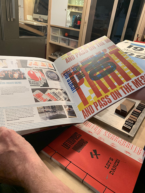
Thomas shared with us that he was headed to Milan for an annual conference with other letterpress artists. Since 2012, a group of letterpress workers and print studios gather to share ideas, collaborate, and make work. From the website of the event, “Letterpress Workers (LPW) was established in 2012 by Officina Tipografica Novepunti. LPW is a short-term collaborative artist residency where letterpress workers from Europe and the Americas work together to share knowledge, cultural approaches, and ways of thinking (not only about letterpress).” Every year they produce a collaborative book, and Thomas showed us stunning examples from years past. We would absolutely die to go– too bad it’s invitation only.
We took a final look around the shop. A small letterpressed card that read “be nice to people” in cornflower blue rested in one of the type cubbies. It was clear that Thomas Gravemaker had taken this to heart, letting three inquisitive tourists interrupt his work on a Tuesday. We wished him a good day and headed out onto the street, unable to believe what we found behind an unlocked door.